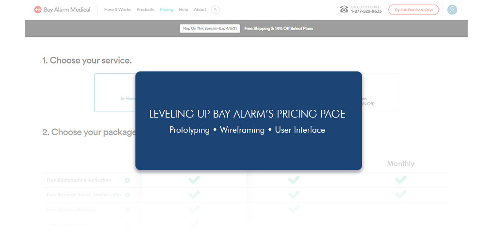


The Project
Bay Alarm Medical provides medical alert systems for the elderly to allow them to remain home and provide peace of mind for the family. I was tasked with condensing our entire product and its variants into one cohesive pricing page.
The Problem
The issue was there was no call to action, which led to an immediate drop-off with users. There was also no indication of price or value. Finally, we had a large amount of information and products that we wanted our potential client to be aware.
The Solution
To create a multi-tiered user interface that condensed all our products into one page with multiple call to action buttons above the fold.

there was no call to action, which led to an immediate drop-off with users
The Design
I began with simple wireframes to create a template I could build upon. The initial important things I had to keep in mind while designing was that we had three products that needed to be present in the design, information describing the benefits of each plan, and some way to highlight the plan we wanted customers to select.
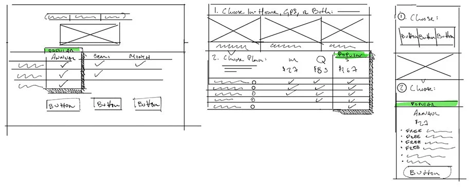
sketches
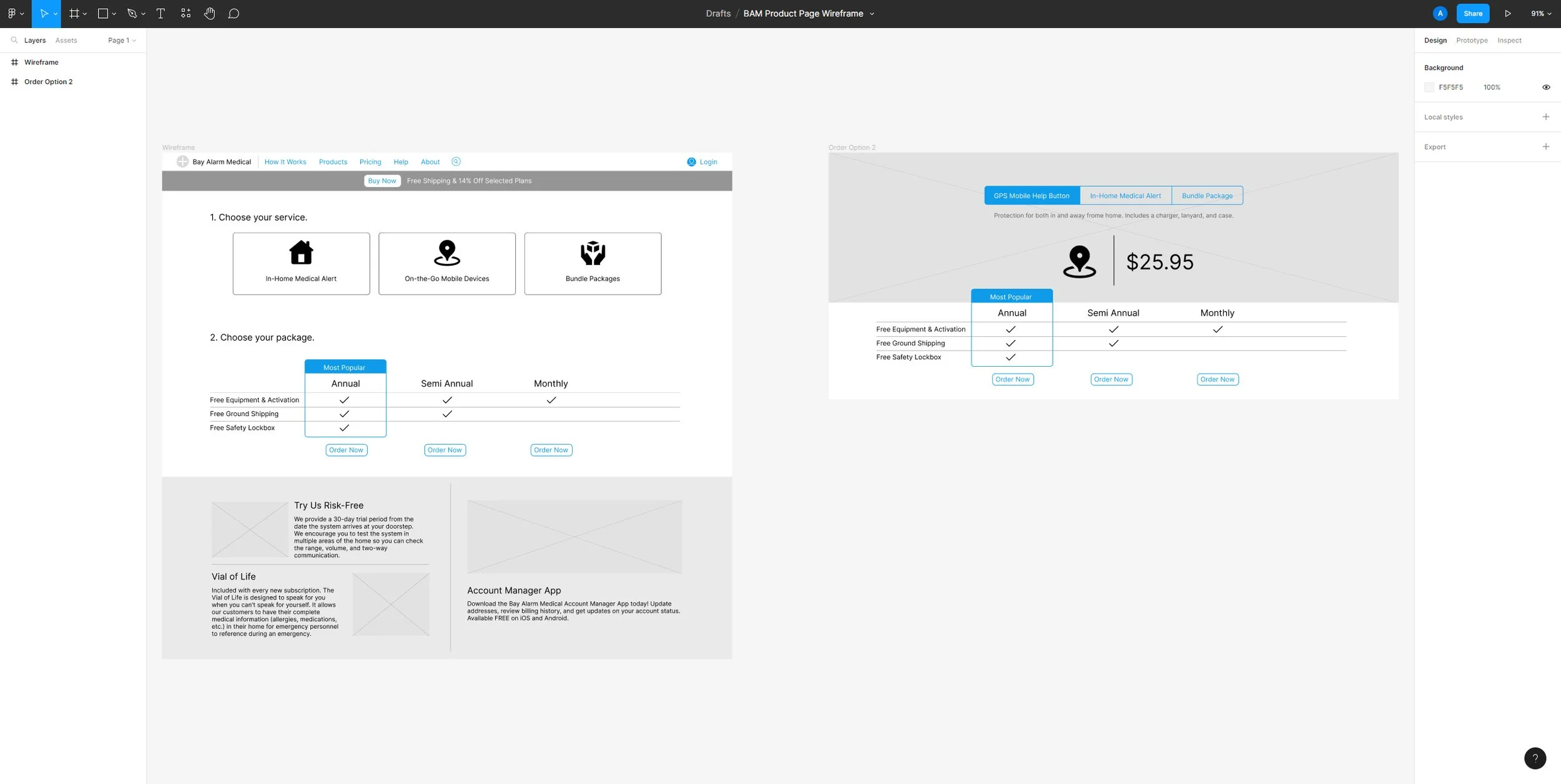
Once I had a general idea for direction based on the wireframe sketches, I took my design into Figma. Here I tried to identify potential problems and develop a simple but effective prototype that I could show to shareholders. Click here to view the Figma file in more detail!
Iterate, repeat repeat repeat
With a general wireframe and direction in place, it was time to start arranging the puzzle pieces.
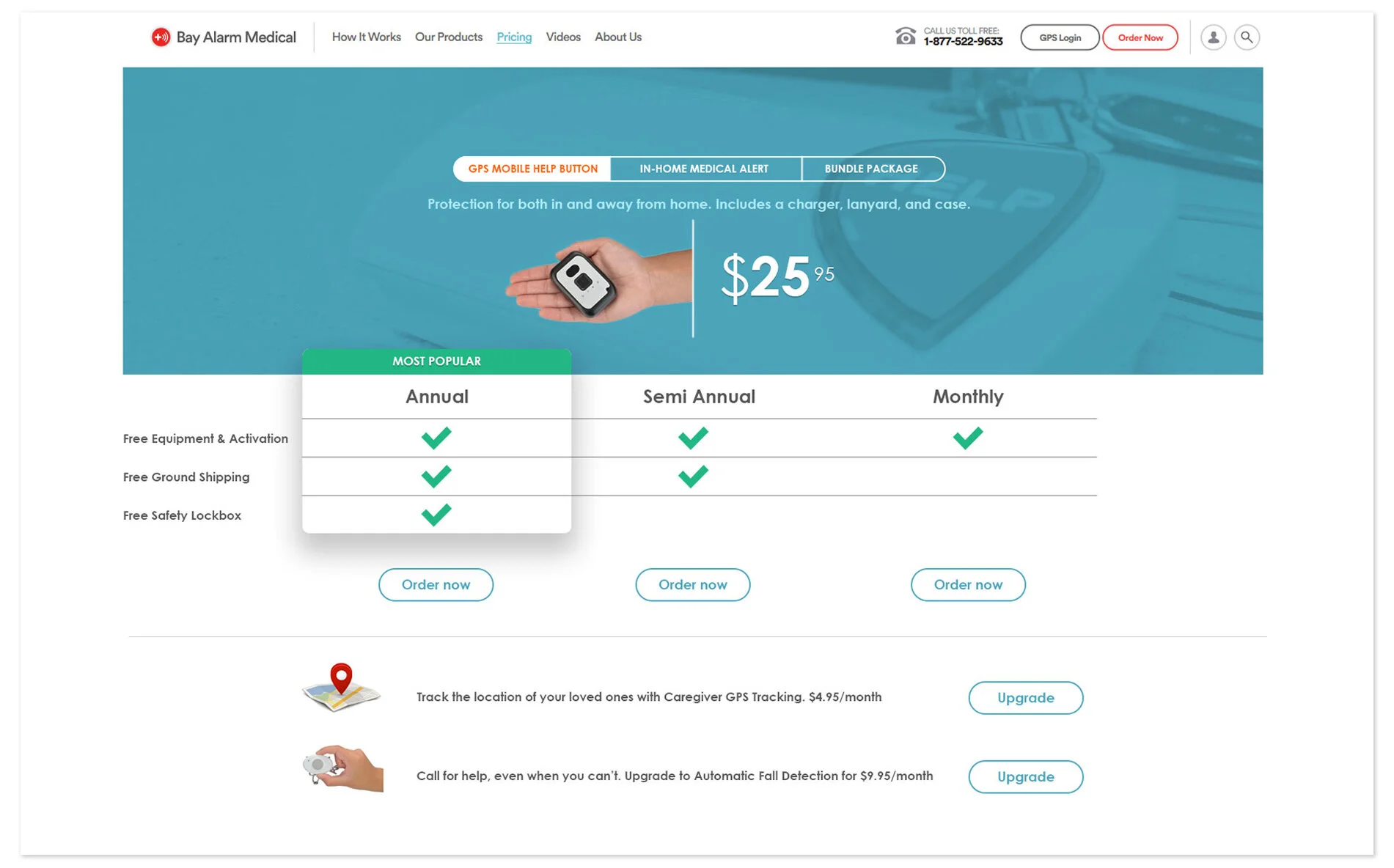
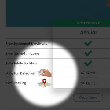
I wanted to find a way to visually highlight items that I found were important. This was eventually scraped.
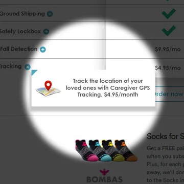
There needed to be more information explaining each item that was both interesting and fun to interact with.
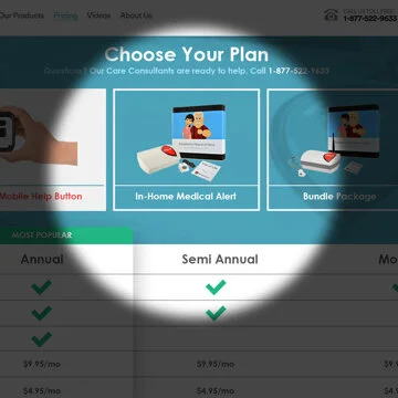
I went through multiple iterations to figure out how to navigate between the different product types.