Government Website Redesign
UX Designers: Amiel Chanowitz, Tanner Colvin
The Problem: The IA and User Flow of WorkSource Oregon is confusing, messy, and outdated.
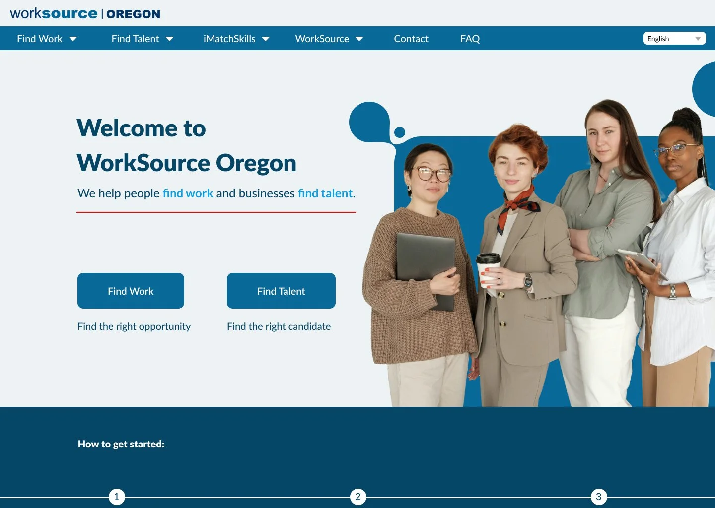
The Solution: Reorganize the IA and redesign the homepage to improve the user experience.
Tools Used: Figma, Figjam, VS Code, Photoshop
About the Client
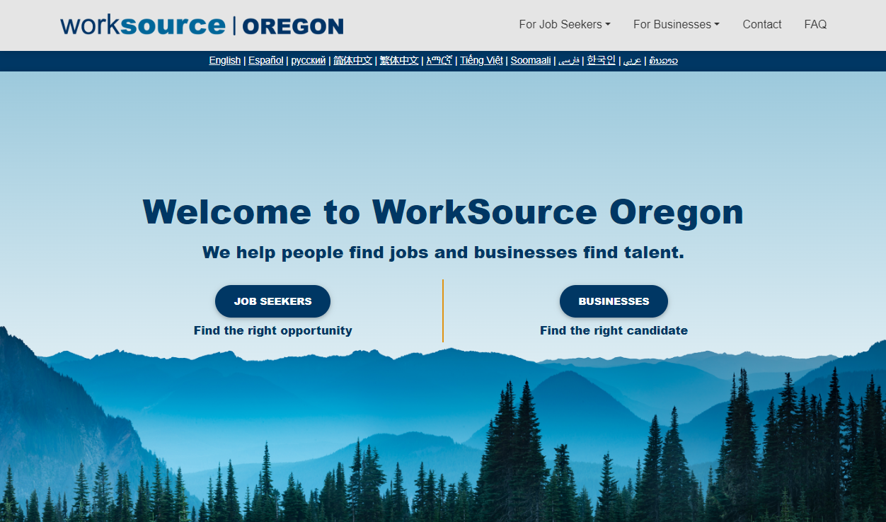
WorkSource Oregon is a job market and career training organization that provides an essential service connecting job seekers and businesses.
However, the website is difficult to navigate, unclear, inconsistent, and dated.
Heuristics Evaluation
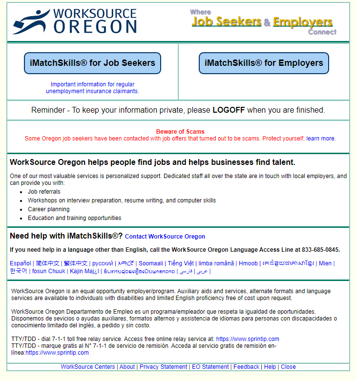
iMatchSkills page
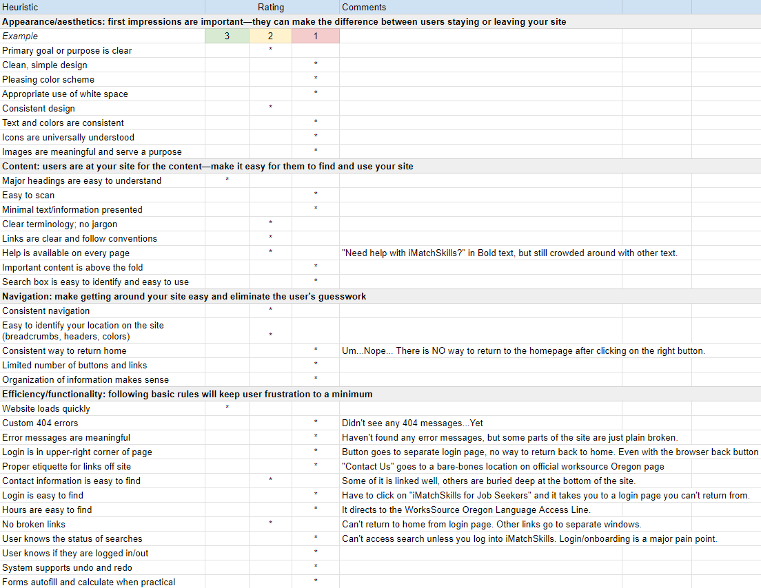
Heuristics Evaluation Document
The first step to fixing this website was to evaluate it. We focused on one of the internal pages, iMatchSkills, as a jumping-off point.
The page was incredibly dated and shared no visual identity with the rest of the website. It is also an essential page that users are required to interact with.
One of the key takeaways was that the navigation of the page is incredibly frustrating, and regularly crashes when you try to navigate backwards.
“Button goes to a separate login page, no way to return back home. Even with the browser back button
USER Persona
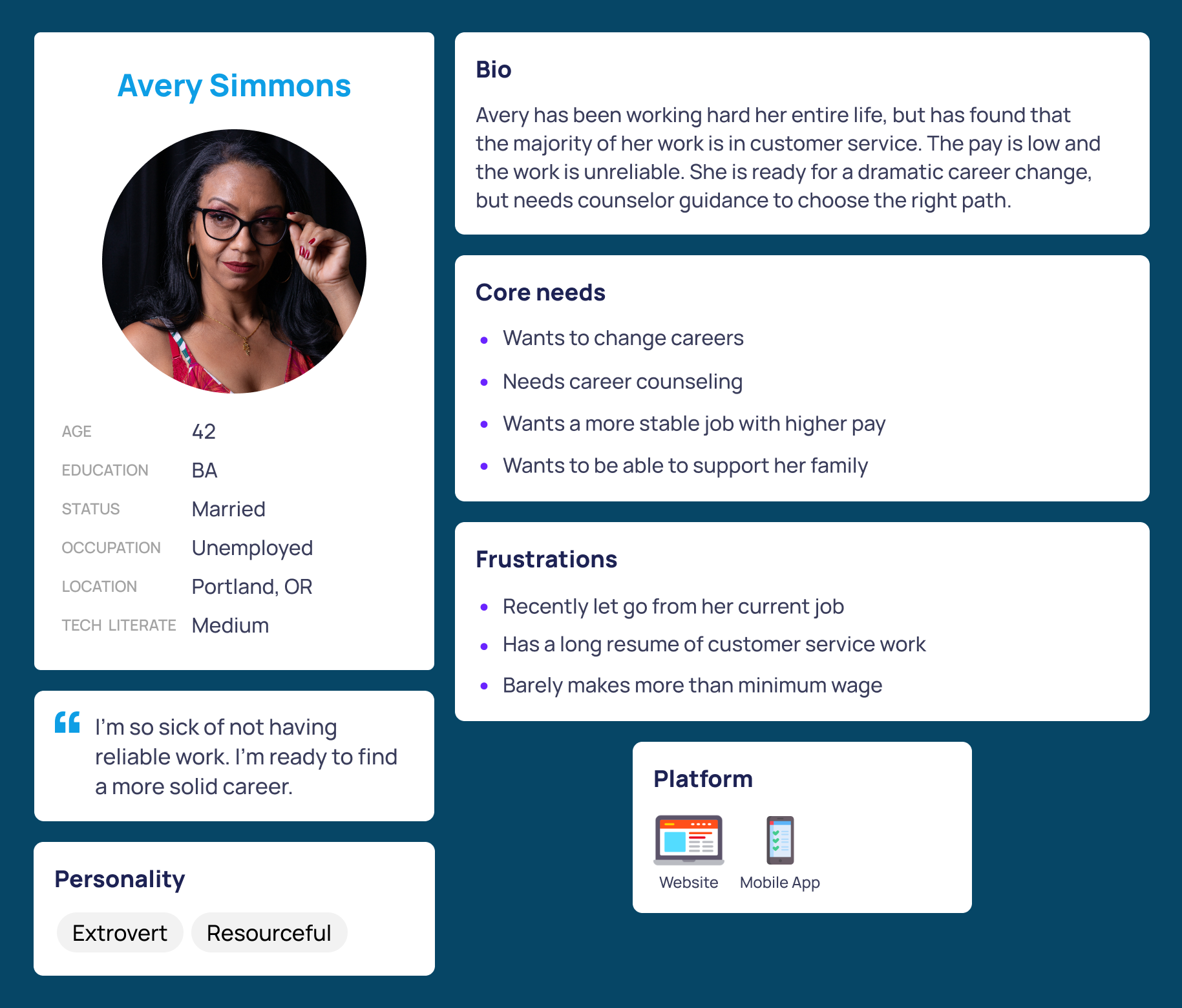
After analyzing the website, our next step was to create a proto persona, or hypothesis on what we imagined the user to be.
For this proto persona, we imagined the user to be someone who was recently laid off and is looking for a career shift. She approaching the middle of her life and needs guidance from the resources that are available to her via WorkSource.
Usability Testing
Now that we have defined Avery as our user we had her run through the main flow of the website which took you from the home page through iMatchSkills and ultimately to signing up through the portal. Once we had our test run in place we began testing the path with five live users. Only one task was to be tested; can users discover the iMatchSkills login page?
“Not easy to access because it’s not on the main screen. If you click on job seekers, and you’re trying to get to iMatchSkills? You have to scroll down. Would I know that’s what I’m looking for? It doesn’t say…Where does it bring up iMatch first?”
“Having a knowledge of how these government websites tend to be. You know that if it’s not right in the immediate vicinity it needs to be hidden somewhere in the test. For most people that would be annoying? It could definitely be better.”
The results from our tests further reinforced our original assessment of the website. It’s difficult to navigate, confusing, and inconsistent. What this helped us discover is where the pain points exist, mainly with website layout and navigation. This allowed us to begin conceptualizing solutions. One main fix that we decided to prioritize was making the navigation more visible to the user, and for the iMatchSkills signup flow to be more intuitive.
Information Architecture
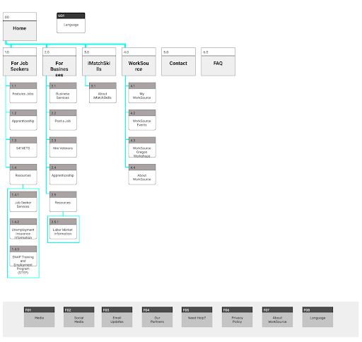
With the pain points discovered and the user identified, I began to tackle the IA. I started with a sitemap to properly reorganize all of the navigation information. While working, it became apparent that I needed to add more pages that didn’t already exist.
A good example being the added page explaining what iMatchSkills is to the user. This is a key feature that is referenced constantly, but the site does not properly describe its function.
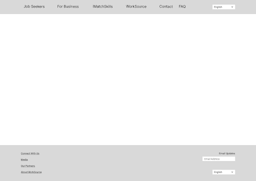
With the IA improved, I was able to move into prototyping. To start, I bult a functional low fidelity navigation bar in Figma, which I could then test with new users.